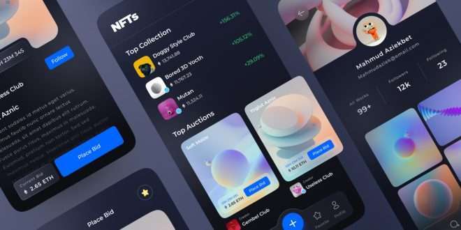
In recent years, dark mode has become a sought-after feature in user interface design. The concept is simple yet powerful: instead of the traditional light-colored background, users can switch to a darker color scheme, reducing the amount of light emitted by their screens. This not only provides a pleasing visual experience, especially in low-light environments, but also offers potential energy savings for devices with OLED or AMOLED displays. But what is it about dark mode that has captured the attention of millions of users worldwide? Let’s delve into the reasons behind its increasing popularity and the driving force behind the dark UI revolution.
The Rise of Dark Mode
Dark mode is no longer limited to a few niche applications. Major operating systems like iOS, Android, and macOS have embraced it, making it available system-wide and across various apps. The concept was initially embraced by developers and power users, but it soon found its way into mainstream applications, such as social media platforms, e-commerce websites, and productivity tools. This widespread adoption has made dark mode a common feature that users expect and appreciate.
The Impact on User Experience
User experience (UX) is at the heart of every successful digital product. Dark mode significantly enhances the overall user experience by providing several key benefits:
Reduced Eye Strain:
Dark mode’s reduced screen glare and lower brightness levels lead to decreased eye strain, particularly during prolonged usage in dimly lit environments.
Improved Focus:
Dark UI designs draw attention to the content and key elements, allowing users to focus on the most critical aspects of the application or website.
Extended Battery Life:
For devices with OLED or AMOLED displays, dark mode can save battery life by consuming less power compared to bright backgrounds.
Aesthetic Appeal:
Dark mode has an undeniable visual appeal that exudes sophistication and modernity, making it a preferred choice for users who seek a sleek and polished interface.
Embracing Dark Mode in UI Design
Developers and designers are not only incorporating dark mode as an option but are also prioritizing it during the design process. Here’s how they achieve the perfect dark UI design:
Understanding User Preferences
The first step is to understand the user’s preferences and expectations. Conducting user surveys and analyzing user feedback can provide valuable insights into how users perceive dark mode and when they prefer to use it.
Implementing UI Design Principles
A successful dark UI design is not just about inverting colors. It involves careful consideration of contrast, typography, and color palettes to maintain readability and ensure a harmonious user experience.
Adapting to Different Devices
Responsive design is critical for modern UI/UX. Designers must ensure that the dark mode works flawlessly across various devices, screen sizes, and resolutions.
Accessibility and Inclusivity
While dark mode has numerous benefits, it might not be suitable for all users. Providing options to toggle between light and dark modes allows users to choose what best suits their needs and preferences.
The Best User Interface Design Software for Dark Mode
Developing an impressive dark UI design requires powerful user interface design software. Here are some of the top tools that simplify the process:
Figma
Figma has gained immense popularity among designers due to its collaborative features and intuitive interface. It allows real-time collaboration, making it an excellent choice for teams working on dark UI projects.
Sketch
Sketch is a macOS-exclusive design tool that offers extensive plugins and integrations, making it a favorite among UI/UX designers who prefer a seamless dark mode design process.
Adobe XD
Adobe XD provides a wide range of design and prototyping capabilities. Its dark mode support ensures that designers can create stunning interfaces while previewing how they appear in both light and dark themes.
InVision Studio
InVision Studio is known for its animation capabilities and streamlined design workflow. It lets designers experiment with various color schemes to achieve the perfect dark UI design.
Commonly Asked Questions
Q1: What are the best practices for implementing dark mode in mobile apps?
A: When implementing dark mode in mobile apps, ensure proper contrast, use legible fonts, and provide users with the option to switch between light and dark modes. Test the design on different devices to ensure consistency.
Q2: Does dark mode save battery on all devices?
A: Dark mode primarily saves battery on devices with OLED or AMOLED displays, as these technologies turn off pixels to display true black colors.
Q3: Are there any accessibility concerns with dark mode?
A: Some users with visual impairments might find dark mode challenging to read. Providing an option to switch to a light theme addresses accessibility concerns.
Q4: Does dark mode have any impact on web accessibility?
A: Yes, dark mode can enhance web accessibility by reducing eye strain for users with sensitivity to bright lights.
Q5: How can I ensure a consistent dark mode experience across all devices?
A: Test the dark UI design on multiple devices and platforms to identify any inconsistencies and make necessary adjustments.
Final Words
Dark mode has become an integral part of the tech world, revolutionizing user experience and design principles. Its growing popularity is a testament to its positive impact on user satisfaction, eye comfort, and overall aesthetic appeal. Embracing dark mode and leveraging powerful user interface design software are crucial steps towards creating visually stunning and user-friendly digital products that stand out in today’s competitive landscape.
Remember, your design decisions should always align with your users’ preferences and needs. By keeping dark mode in mind during the design process, you can delight your users and stay at the forefront of the ever-evolving tech world.
 webfily


