
Related Articles


In this comprehensive guide, we delve into the world of dark mode and its impact on mobile UI/UX design and battery life. As technology evolves, developers are continuously seeking ways to enhance user experiences and optimize device performance. Dark mode, with its visually appealing dark color scheme, has gained immense popularity in recent years. But to truly harness its potential, it’s essential to implement it correctly.
Understanding Dark Mode
Dark mode, also known as night mode or dark theme, is a user interface setting that replaces the traditional bright backgrounds with dark or black backgrounds. The text and icons are displayed in contrasting, vibrant colors, providing an aesthetically pleasing and comfortable visual experience, especially in low-light environments.
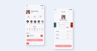
Mobile UI Design Templates for Dark Mode
Implementing dark mode doesn’t mean starting from scratch. Utilizing mobile UI design templates specifically tailored for dark mode can significantly expedite the process without compromising creativity. These templates provide a strong foundation, ensuring consistency and ease of use throughout the application.
When selecting templates, focus on those that complement your app’s theme and functionality. Ensure that the templates are customizable to align with your brand identity and overall design philosophy.
UX Design for Mobile: Embrace Simplicity
User experience (UX) plays a pivotal role in the success of any mobile application. When designing for dark mode, simplicity is key. Avoid overcrowding the interface with unnecessary elements and stick to essential features. Remember, the main goal is to make navigation smooth and intuitive.
Embrace clean lines, clear icons, and legible typography. Strive for a balanced composition that guides users through the app effortlessly. By creating a clutter-free interface, you enhance user engagement and ensure a positive experience.
UI/UX Mobile Design: The Power of Colors
Colors evoke emotions and influence user behavior. In dark mode, your color choices become even more critical. While dark backgrounds are energy-efficient, choosing the right contrasting colors for text and elements is vital for readability.
Stick to a limited color palette to maintain visual harmony. Leverage colors that align with your brand’s identity and are easily distinguishable on the dark backdrop. Perform thorough user testing to ensure that your color choices are inclusive and accessible to all users.
Optimizing Battery Life in Dark Mode
One of the significant benefits of dark mode is its potential to conserve battery life, particularly on devices with OLED or AMOLED displays. When pixels display true black, they consume less power than when displaying bright colors.
However, it’s essential to remember that the battery-saving benefits depend on the device’s screen technology and brightness settings. In some cases, the energy saved might be negligible.
Dark Mode and OLED/AMOLED Displays
OLED and AMOLED displays are prevalent in modern smartphones due to their vibrant colors and high contrast ratios. In dark mode, these displays truly shine, as each pixel can be turned off to display black. This pixel-level control enhances battery performance, making dark mode highly effective in such devices.
Importance of Manual Switch and Auto-Detection
Allow users to control dark mode preferences with a manual switch. Some users might prefer the traditional light mode, especially during daylight hours. By offering a choice, you cater to a broader audience.
Additionally, incorporate an automatic detection feature that adjusts the mode based on ambient light conditions. This way, users can enjoy the best of both worlds without having to manually switch between modes.
Implementing Dark Mode Consistency
Consistency is paramount when integrating dark mode into your application. Ensure that every screen, dialog, and element adheres to the same dark mode principles. Inconsistencies can disrupt the user experience and lead to frustration.
Perform thorough testing on various devices to guarantee that the dark mode is uniform and seamless across the entire app. Strive to create a visually cohesive experience that users will appreciate.
Common Myths and Misconceptions
Several myths and misconceptions surround dark mode and its impact on UI/UX and battery life. Let’s debunk some of the most common ones:
Dark Mode Saves Battery on All Devices: While true for OLED/AMOLED screens, it doesn’t significantly impact battery life on devices with LCD screens.
Dark Mode is Always Better for the Eyes: While dark mode reduces eye strain in low-light conditions, it’s not necessarily superior in all situations. Ambient lighting and personal preferences play a role in user comfort.
Dark Mode is Universal: Dark mode might not suit every app or cater to every user’s preference. Providing the option for users to choose their preferred mode is essential.
Final Words
In conclusion, implementing dark mode done right can greatly enhance mobile UI/UX and optimize battery life on compatible devices. Utilize mobile UI design templates, prioritize user experience through simplicity and color choices, and ensure consistency throughout the application. Offering manual and auto-detection options for dark mode preferences enhances user satisfaction. Remember to dispel common myths and misconceptions to provide an informed approach.
Commonly Asked Questions
Q1: Can dark mode be harmful to some users’ eyes?
A: While dark mode can reduce eye strain in low-light conditions, it may not suit everyone. Providing an option to switch between light and dark modes caters to diverse user preferences.
Q2: Will dark mode extend battery life on all devices?
A: Dark mode significantly benefits devices with OLED/AMOLED screens, where pixels can display true black. On devices with LCD screens, the impact on battery life might be minimal.
Q3: Should I implement dark mode in my app even if it’s not the main design theme?
A: Dark mode adoption depends on your app’s target audience and design philosophy. Consider conducting user surveys or A/B testing to gauge user preferences.
Q4: Are there any accessibility concerns with dark mode?
A: Yes, color contrast is crucial for readability. Ensure that text and elements have sufficient contrast against dark backgrounds to cater to users with visual impairments.
Q5: How do I ensure consistency in dark mode implementation?
A: Test your dark mode design on various devices to ensure a uniform experience. Pay attention to colors, typography, and icons to maintain visual cohesiveness.
